Thanks to John Venn, I now have a part-time job as a Venn diagram graphic artist/specialist.
John Venn is most known for creating and introducing the Venn diagram in 1880, which has been used in the fields of set theory, probability, logic, statistics, and computer science according to his Wikipedia page.
Interestingly, Venn himself did not use the term “Venn diagram,” he referred to his diagrams as “Eulerian Circles.” It wasn’t until 1918 that Venn’s invention was referred as a “Venn diagram” by Clarence Irving Lewis in his book “A Survey of Symbolic Logic.”
To recognize the anniversary of John Venn’s birthday I present a dozen of my recent Venn diagrams below, which have all appeared on CD, Facebook and/or Twitter.
Thanks to John Venn, I now have a part-time job as a Venn diagram graphic artist/specialist – they are a very effective way to illustrate graphically the intellectual inconsistencies that are widespread and commonplace among the public, especially with our left-leaning friends. Over the years, I have created nearly 150 Venn diagrams and they are available here at this link: Venn Diagram Archives.
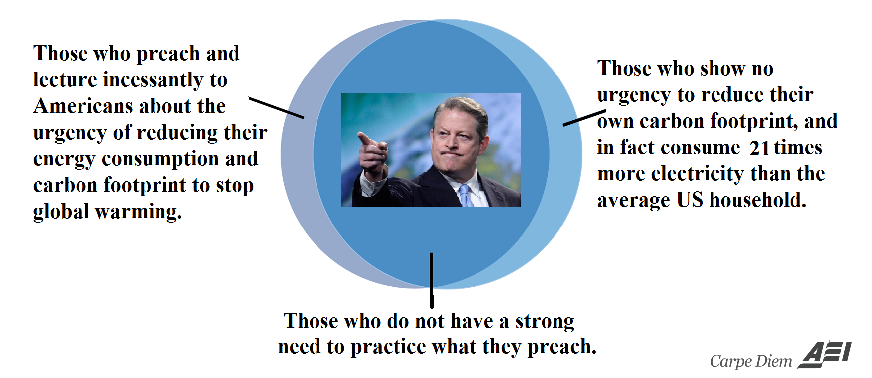
- Venn Diagram I (above) on Al “Bigfoot” Gore’s hypocrisy when it comes to his YUGE carbon footprint. Drew Johnson, whose report exposed the fact that Bigfoot Gore uses 21 times more electricity than the average US family, commented “It’s frustrating if you’re an environmentalist because Gore sets himself up as a prophet – but he’s actually a fraud and a charlatan. You’ve got to ring the bell of hypocrisy here. It’s like a religious leader cheating on his wife.” Note also that the report only covers Al Gore’s voracious energy consumption at his main 10,000 square foot residence in Nashville, where he apparently lives alone and does not include his other two residences.
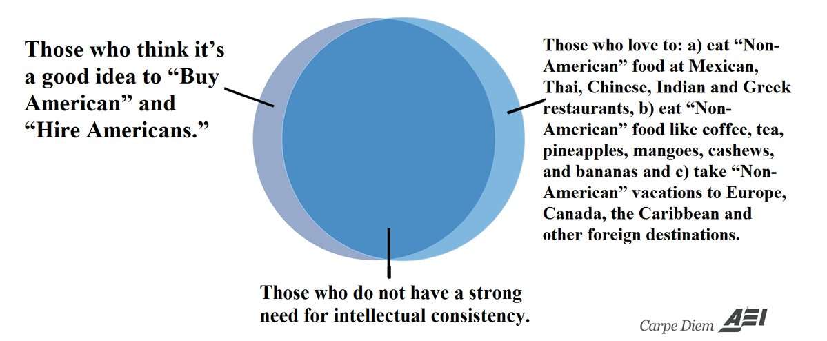
- Venn Diagram II (above) on those who support “Buy American” and “Hire Americans” in theory, but love to shop internationally and travel globally.
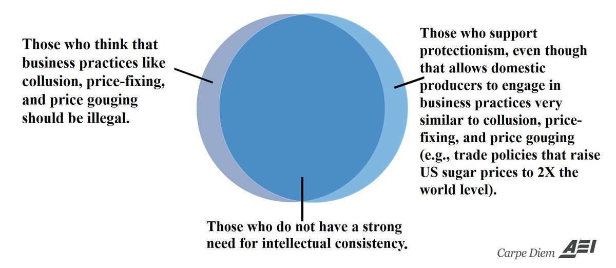
- Venn Diagram III (above). On the intellectual inconsistency of protectionists.

- Venn Diagram IV (above). Equal opportunity/meritocracy or special preferences/discrimination?
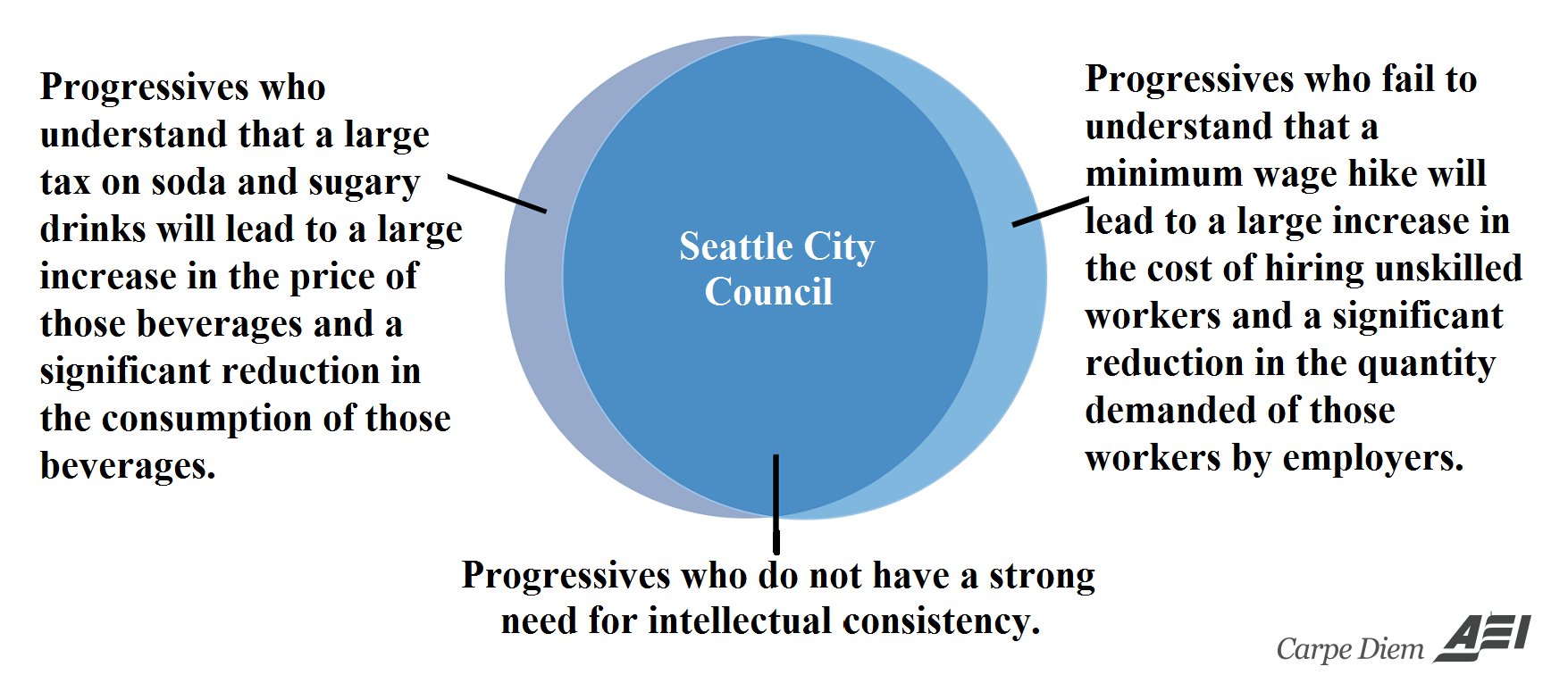
- Venn Diagram V (above). If artificially higher soda prices reduce consumption, wouldn’t higher minimum wages do the same?
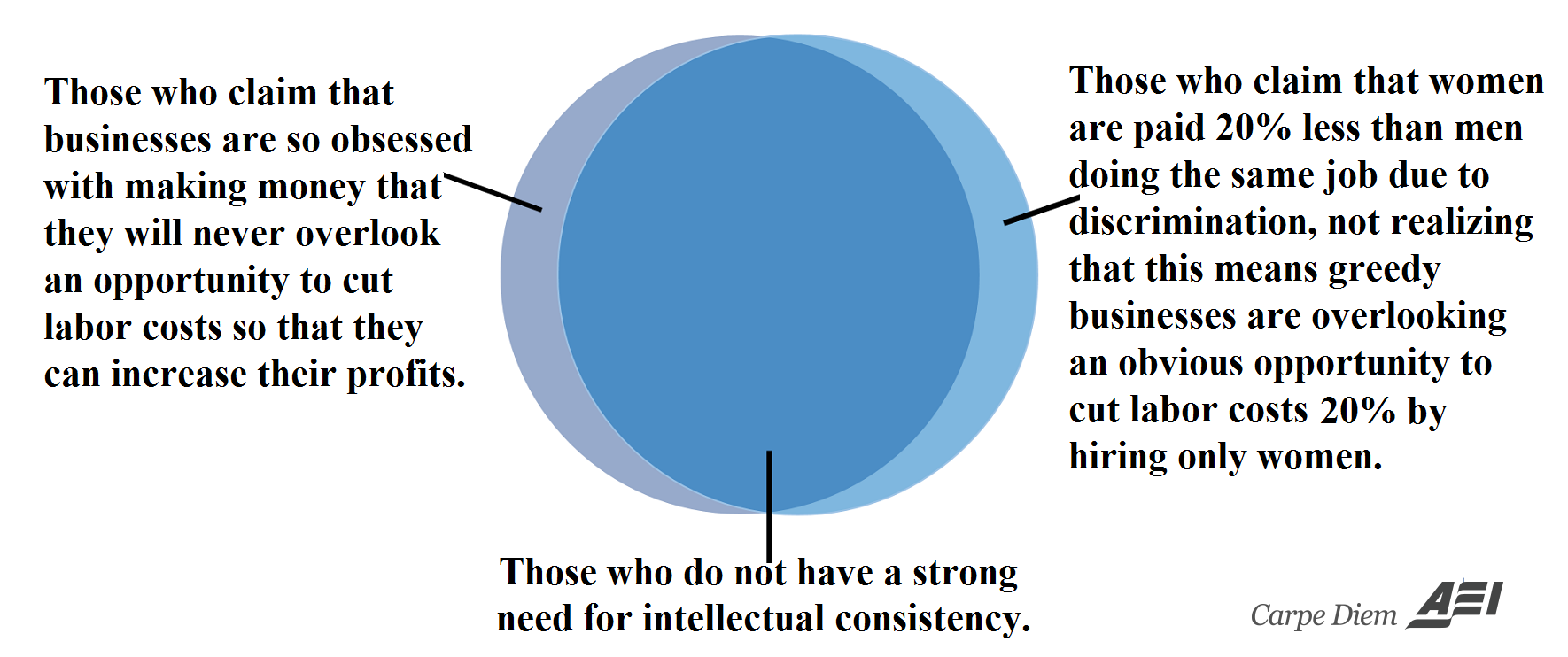
- Venn Diagram VI (above). If business cares about making as much money as possible, wouldn’t they hire only women if there was a 20% gender pay gap due to discrimination?
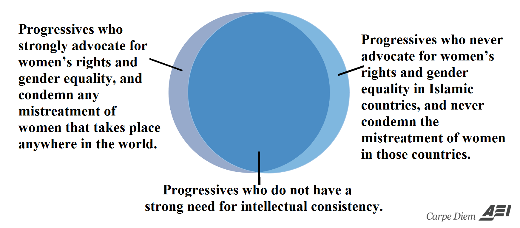
- Venn Diagram VII (above). Islam gets a pass from gender activists, feminists, and progressives?
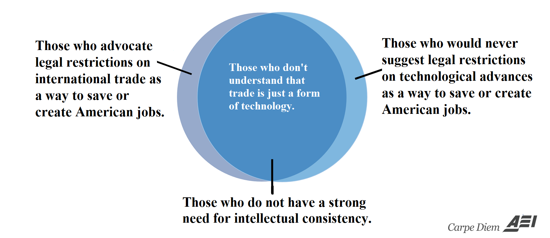
- Venn Diagram VII (above). More on the inconsistency of protectionists and mercantilists.
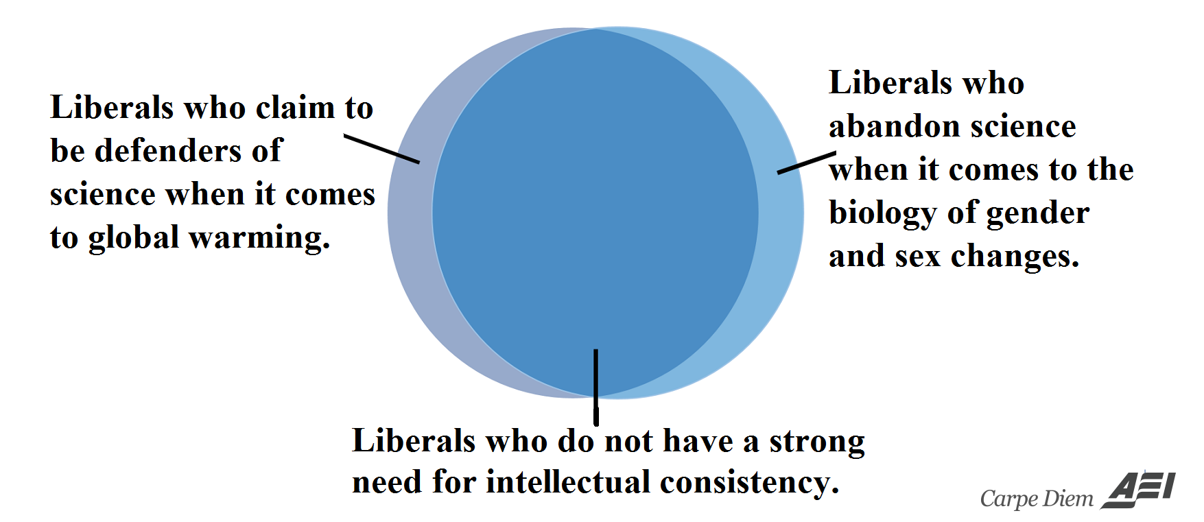
- Venn Diagram IX (above). How do liberals claim to both embrace and reject science simultaneously?
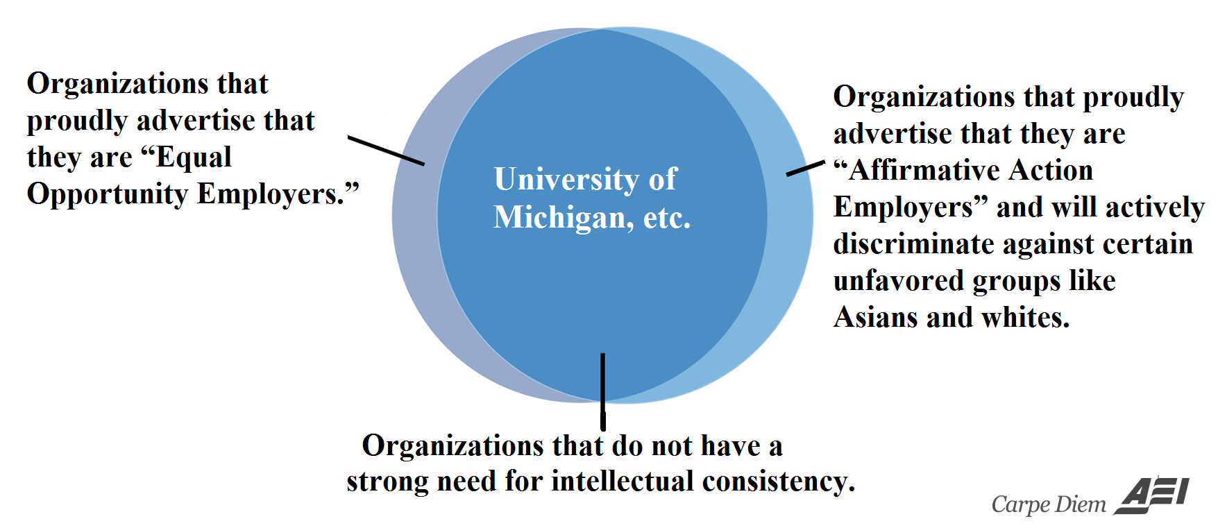
- Venn Diagram X (above). Employers who proudly advertise that they are both Equal Opportunity/Affirmative Action employers. Don’t you have to make a choice?
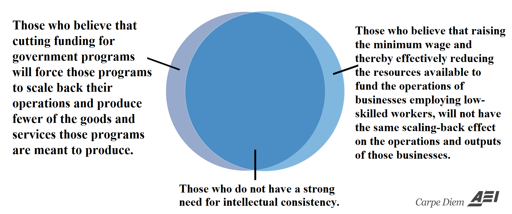
- Venn Diagram XI (above). Created in response to a question from Don Boudreaux: “If cutting the budget of a government program causes the operation of that program to shrink, why does not raising the minimum wage inevitably cause the operations of employers of low-skilled workers to shrink?” Good question.
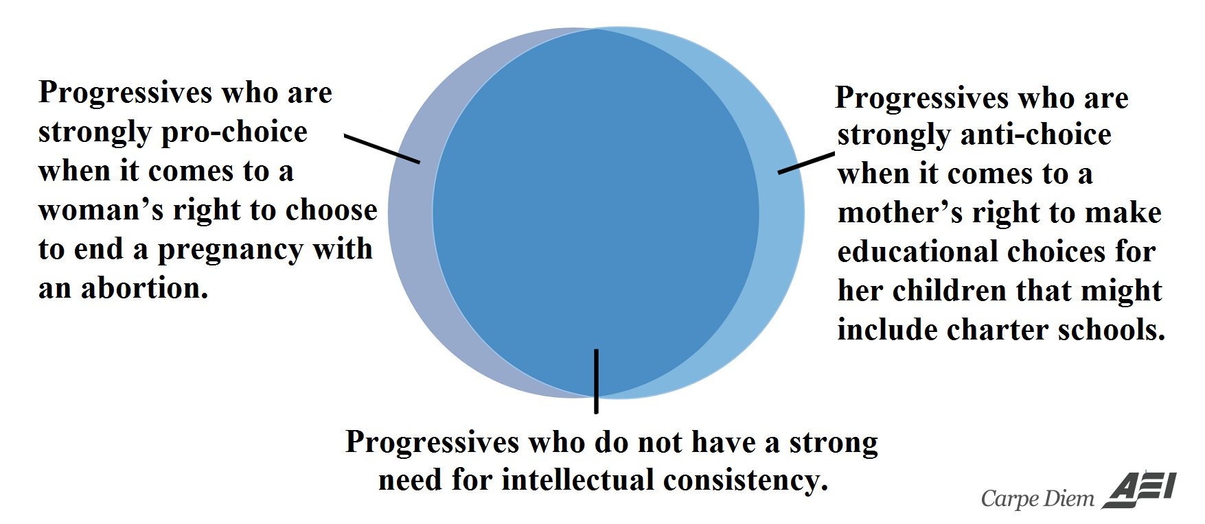
- Venn Diagram XII (above). Are progressives pro-choice or not?
Reprinted from American Enterprise Institute.